Imagine you’re designing a vibrant poster for an upcoming event. You choose the most striking colors, but when it gets printed, the hues look completely different from what you saw on your screen. What’s going on? The answer lies in understanding the difference between CMYK and RGB color models.
These two color systems are essential in the world of design, yet they serve very different purposes. RGB, which stands for Red, Green, and Blue, is used for digital displays, while CMYK—Cyan, Magenta, Yellow, and Key (Black)—is the standard for printing. Knowing when and how to use each can make or break your project, ensuring that what you see is truly what you get. Jump into this guide to unlock the secrets behind these color models and elevate your design game.
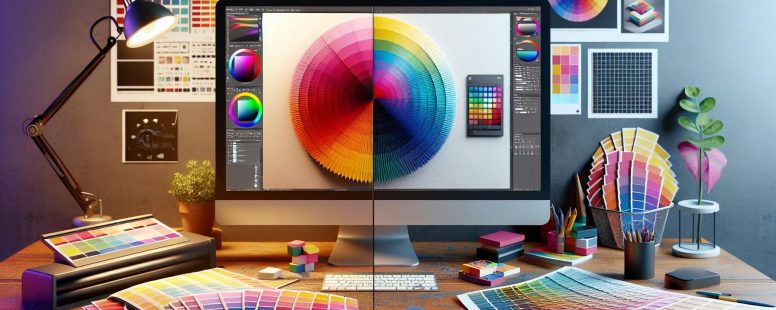
Understanding CMYK and RGB
When working on design projects, it’s crucial to understand the differences between CMYK and RGB color models. This section dives into what each model entails and why it’s important for designers.
What is CMYK?
CMYK stands for Cyan, Magenta, Yellow, and Key (Black). This color model is primarily used in printing. Each color uses a subtractive method, where colors are created by subtracting varying wavelengths of light. Essentially, each ink reduces the brightness of the white paper. Think about how a printer works: when you print a document, the printer mixes these four colors to produce a wide spectrum of accurate hues. The colors get darker with each additional ink layer until reaching black, the absence of light.
Printers use CMYK because it suits physical mediums. You achieve precise and consistent color reproduction necessary for branding, brochures, magazines, and any printed material. If you ever wondered why your printed images don’t match what you see on the screen, it’s due to the conversion process from RGB. Designers should create in CMYK if their final product will be printed, ensuring colors remain true to the original design.
What is RGB?
RGB stands for Red, Green, and Blue, which are the primary colors used in digital displays. This model employs an additive method, where colors are created by combining light. Each pixel on a screen emits varying intensities of red, green, and blue light. By adjusting the intensity of these colors, you can produce millions of different colors. If you’ve ever adjusted the brightness or color settings on your monitor, you’re tweaking the RGB values.
RGB is perfect for anything viewed on a screen, like websites, apps, and videos. Digital content relies on this model because screens, projectors, and televisions all use light to produce images. When you design with RGB, you’re ensuring vivid and consistent colors across all digital mediums. Notably, RGB offers a broader color spectrum than CMYK. But, transferring RGB files directly to print without conversion affects color accuracy, often leading to unwanted surprises. Hence, it’s vital to convert RGB designs to CMYK for print to maintain color fidelity.
Understanding these color models ensures your designs maintain their intended impact, whether viewed on paper or a screen.
Color Theory Basics
Understanding the foundation of color theory is crucial for working with CMYK and RGB models. These models operate differently depending on whether you’re creating digital or print designs.
Additive Colors
Additive colors arise when light combines. RGB (Red, Green, Blue) is an example, because it’s used in digital displays. Screens project colors by combining light in varying intensities. When all three colors overlap at full intensity, they create white. For example, your computer monitor or TV uses RGB to display images, blending colors to present depth and vibrancy.
In additive color mixing, starting with darkness and adding light creates visible colors. This is how digital screens work efficiently. If you’ve ever adjusted the brightness on your screen, you’ve affected how RGB colors mix. According to the digital color theory, your favorite video game or a vivid online advertisement relies on this additive process.
Subtractive Colors
Subtractive colors function by removing light. CMYK (Cyan, Magenta, Yellow, Key/Black) operates this way, mostly in printing. These colors absorb light they don’t reflect; mixing all at full intensity results in black. Printers use this method to precisely transfer designs to paper, ensuring the colors align with your vision.
When you print a photo, the printer combines inks. It layers cyan, magenta, yellow, and black to create the desired hues. Practical examples include magazines, posters, and packaging, where color accuracy is vital for brand consistency. As a user, converting your digital designs from RGB to CMYK before printing maintains color integrity.
Real-World Application
In everyday life, the distinction between these models affects everything from advertising to personal projects. Wonder why your printed flyer looks different than it did on your screen? It’s because RGB cannot directly translate to CMYK. Hence, knowledge of these principles helps clarify and anticipate such discrepancies in your creative work.
Understanding these basics empowers your design process, enabling color accuracy. Applying this knowledge, you enhance your project’s impact, whether online or in print.
Practical Applications
Understanding the practical applications of CMYK and RGB helps in choosing the right color model for design projects, ensuring that the final product meets expectations. Knowing where to use each model can elevate the quality and impact of your work.
Use of CMYK in Printing
CMYK is essential in the printing industry. This color model ensures that printed materials, like brochures, magazines, and packaging, accurately represent the intended colors. For example, a company logo designed in RGB might not look the same when printed if it’s not converted to CMYK first. Without this conversion, the vibrant tones displayed on screens might appear dull on paper. Printers rely on the subtractive process to mix cyan, magenta, yellow, and black inks, creating a wide range of colors.
When you print a photograph for a high-quality art book, CMYK is the go-to choice. This model helps in getting precise color reproduction, which is crucial for capturing the nuances of the artwork. Professional printers use CMYK settings in software like Adobe InDesign and Photoshop to ensure consistency across various printed materials.
Use of RGB in Digital Media
RGB reigns supreme in the digital world. This color model is used for anything that appears on a screen, such as websites, digital advertisements, and social media graphics. When creating a new website layout, you choose RGB because it allows you to work with a broader color palette, producing vibrant, eye-catching designs.
For instance, when designing a banner ad for an online marketing campaign, RGB is the better choice. This model combines red, green, and blue light to create various colors, helping you achieve the brightest and most engaging visuals. Game developers also use RGB to make sure that the on-screen graphics are sharp and visually appealing.
When showing a design on a projector during a presentation, RGB will ensure the colors look their best, making your slides more appealing. Tools like Microsoft PowerPoint and digital design platforms inherently work with RGB to provide stunning on-screen results.
By leveraging the strengths of CMYK and RGB, you can ensure that your designs look their best, whether in print or on digital platforms. This knowledge helps in making informed decisions, eventually enhancing the quality and effectiveness of your projects.
Key Differences
Understanding the differences between CMYK and RGB is essential for achieving accurate color representation in your projects, whether they are digital or print. Here’s a detailed look under two main categories – Color Range and Gamut, and File Formats and Usability.
Color Range and Gamut
The color range in RGB and CMYK differs significantly due to their underlying principles. RGB, used for digital displays, relies on an additive color method where red, green, and blue lights combine to produce various colors. This model can create a broader range of vibrant and bright colors compared to CMYK.
Example: On your computer screen, you’ll notice how vivid and bright images can appear, thanks to the RGB model’s extensive color gamut.
CMYK, on the other hand, employs a subtractive method by mixing cyan, magenta, yellow, and key (black) inks. This approach naturally limits its color range because it subtracts brightness from the white paper it’s printed on.
Example: Printed brochures or magazines usually have colors that appear slightly different from what you see on a digital screen. This discrepancy arises because CMYK cannot replicate all the colors achievable in RGB.
File Formats and Usability
The file formats compatible with RGB and CMYK also vary, influencing their usability across different platforms. RGB is used in file formats like JPEG, PNG, and GIF, which are ideal for online content and digital media.
Usability: For web design, advertisements, or any other digital artworks, RGB ensures that colors remain consistent and vibrant across different devices.
Conversely, CMYK is commonly used in file formats such as PDF, EPS, and TIFF, ideal for professional printing purposes.
Usability: If you’re preparing a print project like a business card or a flyer, converting your designs to CMYK ensures that the colors on screen closely match what gets printed.
Each model’s usability reflects its strengths, maximizing the effectiveness of your design projects either in print or on digital platforms.
Conversion Between CMYK and RGB
Understanding how to convert between CMYK and RGB is key for achieving accurate color representation across mediums.
Tools for Conversion
Various software and online tools simplify the conversion process between CMYK and RGB. Adobe Photoshop, for instance, allows you to easily switch color modes by exploring to “Image” > “Mode.” In Illustrator, you can adjust color settings through “File” > “Document Color Mode.” Online tools like RapidTables and ColorMine also offer quick and straightforward conversion options.
You might frequently use these tools in professional scenarios. Imagine you’re preparing a digital ad and need to ensure it looks perfect in a printed magazine. Utilizing these conversion tools helps you maintain color fidelity, ensuring your vibrant online visuals translate well into print. Third-party plugins for graphic design software can also aid in achieving more precise conversions.
Potential Pitfalls
Transitioning between CMYK and RGB can introduce several challenges. One common issue arises from the different color gamuts. RGB encompasses a broader gamut, which means some colors may not replicate accurately in the CMYK model. This often results in muted or altered hues when RGB designs are printed.
Consider double-checking colors when converting a bright neon green from your website design for print material. Because CMYK can’t replicate such vibrant colors, the printed result may appear less dynamic, causing unintended impacts on your branding.
Plus, inconsistent monitor calibations can add to the problem. If your screen isn’t calibrated correctly, what you see on the screen might not match the final printed product. Regularly calibrating your monitor using tools like Datacolor Spyder helps mitigate this issue.
Finally, file formats also play a significant role in conversion efficiency. While RGB files typically use JPEG or PNG, CMYK files often require PDF or TIFF formats. Incorrectly importing or exporting files during conversion can result in significant color discrepancies.
By considering these potential pitfalls, you can better navigate the complex world of color conversion. Use available tools effectively and stay vigilant about color consistency to ensure your designs retain their intended impact across all mediums.
Conclusion
Understanding the differences between CMYK and RGB is essential for any designer aiming to create impactful visual content. By mastering when to use each color model, you can ensure your designs look their best, whether on screen or in print. Leveraging tools for accurate color conversion and being aware of potential pitfalls will help you maintain color fidelity across various mediums. Embrace the strengths of both models to enhance the quality and effectiveness of your projects, making informed decisions that lead to stunning and accurate results.
To provide the best experiences, we use technologies like cookies to store and/or access device information. Consenting to these technologies will allow us to process data such as browsing behaviour or unique IDs on this site. Not consenting or withdrawing consent, may adversely affect certain features and functions.
Functional
Always active
The technical storage or access is strictly necessary for the legitimate purpose of enabling the use of a specific service explicitly requested by the subscriber or user, or for the sole purpose of carrying out the transmission of a communication over an electronic communications network.
Preferences
The technical storage or access is necessary for the legitimate purpose of storing preferences that are not requested by the subscriber or user.
Statistics
The technical storage or access that is used exclusively for statistical purposes.The technical storage or access that is used exclusively for anonymous statistical purposes. Without a subpoena, voluntary compliance on the part of your Internet Service Provider, or additional records from a third party, information stored or retrieved for this purpose alone cannot usually be used to identify you.
Marketing
The technical storage or access is required to create user profiles to send advertising, or to track the user on a website or across several websites for similar marketing purposes.