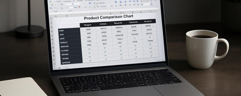
Imagine spending hours poring over laptop specs only to realize you overlooked a crucial feature that would have tipped the scales. That’s where a well-crafted product comparison chart in Excel becomes your secret weapon.
It’s more than just a grid of numbers; it’s a clear map through a maze of options, turning chaos into clarity. When set up correctly, this tool can reveal hidden gems and save you from buyer’s remorse.
Think of it as your personal compass—guiding you effortlessly toward the perfect choice.
Choosing Product Features for Comparison
Choosing the right features to compare when selecting a product is important. The key is to focus on what really matters. First, decide what features impact how well the product works, how much it costs, and how easy it is to use. For example, if you’re buying a new phone, you might look at battery life, camera quality, and price. Not every detail matters. Some features are standard across many brands, while others give a product an advantage.
Ask yourself questions like: What do users care about most? Are there features missing in current options? If a feature doesn’t make a difference in everyday use, it might not be worth including in your comparison. This way, you avoid cluttering your chart with unnecessary information. Instead, you can clearly see which product is best for your needs.
Some people might think comparing many features is helpful, but it can lead to confusion. Focusing on the most important features helps you make a smarter choice without feeling overwhelmed. Keep your comparison simple and practical. This method helps you pick the product that fits you best, based on what truly matters.
How to Set Up a Product Comparison Chart in Excel
A product comparison chart in Excel is a simple way to see how different products stack up against each other. It helps you find the best option by comparing key features. Here are the steps to set one up:
First, pick the main features you want to compare. These could be price, size, brand, or any other important factor. For example, if you’re comparing smartphones, your features might be battery life, camera quality, and price. Think about what matters most to your audience.
Next, organize your data. Make a table with product names in the first column and features in the top row. Fill in the details for each product. Use clear labels so you and others can easily understand what each row and column mean.
To keep your data accurate, use data validation tools in Excel. For example, you can set dropdown menus for ratings or categories. This helps avoid mistakes, like typing “batterry” instead of “battery.” It also makes updating the chart easier later.
Adding charts or graphs can make the differences easier to see. For example, a bar chart showing battery life for each phone can give a quick visual comparison. This helps people quickly understand what stands out.
Ask others for feedback on your chart. Maybe friends or coworkers can spot confusing parts or suggest better features. As your product lineup changes, update the chart so it stays useful.
Finally, if you need to access your comparison on the go, save your Excel file to a cloud service like OneDrive or Google Drive. This way, you can look at it from your phone or tablet anytime.
Remember, a good comparison chart isn’t perfect. It depends on honest data and clear organization. It helps you see the differences quickly but won’t tell you which product is best for everyone. Use it as a tool, not the final decision-maker.
Using Excel Templates to Build Your Comparison Chart
Using Excel templates to make your comparison chart is a smart move. A comparison chart helps you see the differences between products clearly. If you want to do it quick and easy, templates are your best friend. They come with ready-made layouts and formulas that save time and reduce mistakes. For example, some templates have drop-down menus to pick products, which makes data entry simple. Others have formulas that automatically spot trends or highlight the best options.
Some people prefer building their own chart from scratch because they want full control. But that takes time and can lead to errors. Templates are a good starting point. You just import your data, customize colors or labels, and your chart is ready faster. Plus, many templates let you work together with others easily, which is helpful for teams.
However, templates are not perfect. They might not fit every need exactly, and some might be hard to customize. If you use a poorly designed template, your chart could look messy or give wrong info. Also, some free templates don’t have advanced features, so check if it offers the tools you need.
Adding and Customizing Columns for Price, Ratings, and Reviews
Adding and customizing columns for price, ratings, and reviews is the key to making your comparison chart really helpful. The main idea is to organize data so it’s easy to see differences quickly.
To do this, start by adding columns for price, ratings, and reviews. For example, if you’re comparing smartphones, include a price column that shows how much each phone costs. Use currency formatting to make prices clear and consistent. Ratings can be shown on a scale from 1 to 5 stars, and make sure all ratings follow the same scale. Reviews can be summarized or shown as average scores, so you can quickly see what customers think.
Next, customize your columns to improve readability. Adjust the width so each column fits its data and use bold headers to keep everything clear. Adding filters allows you to sort products by price or ratings, making it easier to find the best options fast. For instance, you can filter to see only phones that cost less than $500 or have ratings above 4 stars.
A common mistake is not formatting data correctly. For example, if prices aren’t in currency format, it’s hard to compare. Also, some people forget to keep scales consistent, which can mislead you. Remember, a well-structured chart saves time and helps you make smarter choices. But be careful — too many filters or cluttered columns can make your chart confusing instead of helpful.
In the end, customizing these columns turns raw data into clear, useful insights. Whether you’re choosing a new laptop or a kitchen gadget, a well-organized chart can help you see which product offers the best value. Just keep your data simple and consistent, so you’re not overwhelmed by details. Would you want to compare a lot of products or just a few? Think about what matters most to you when organizing your data.
How to Use Excel Formulas to Score Products Automatically
Excel formulas can help you score products automatically, making comparison easier. Here’s how to do it step by step. First, use the SUMPRODUCT formula to give weight to different criteria like price, ratings, and reviews. For example, if you want to compare a phone based on price and customer ratings, you can assign weights to each factor and multiply them using SUMPRODUCT. This saves time because it calculates everything in one step.
Next, use the IF function to assign scores based on specific thresholds. Say you want to give a higher score to products with ratings above 4.0. You can write an IF formula that checks the rating and assigns a score of 10 if it’s higher or equal, or 5 if it’s lower. This makes scoring automatic so you don’t have to do it manually each time.
Finally, combine these formulas with AVERAGE or MAX to normalize scores across different products. For example, you might want to compare the best score among all products using MAX, or find the average score with AVERAGE. This helps you see which product is the best overall.
Remember, the key is to keep formulas simple and avoid repeating the same calculations. If your formulas are too complex, they can slow down your sheet or cause errors. Once you set them up, they update automatically when you change data. This makes your product comparison dynamic and reliable.
But be careful. Some formulas might give false results if data isn’t entered carefully. Also, relying only on formulas can hide other important factors, like user experience or brand reputation. Use formulas as a guide, but don’t forget to consider your own judgment too.
In short, mastering these Excel formulas can turn your product comparison into a quick, powerful tool. It saves time, reduces mistakes, and helps you pick the best product faster. Just test your formulas first to make sure they work correctly before trusting the results completely.
Applying Conditional Formatting for Visual Insights
Applying conditional formatting helps you see important data quickly. It shows which numbers are high or low by using colors. For example, if you compare different phone brands, color scales can highlight the best features or prices. This makes your charts easier to read and understand fast.
To do this, follow simple steps. First, select the data you want to highlight. Then, go to the conditional formatting menu in tools like Excel or Google Sheets. Choose a color scale, such as green to red, to show good to bad values. Now, the chart instantly shows you where the top and bottom data points are.
Some people find this helpful for spotting trends without counting every number. But it has limits too. Colors might be confusing if not used carefully, and it only shows patterns, not detailed info. Still, for quick insights, it’s a simple way to make data clearer.
Imagine you’re comparing laptops and want to see which has the best battery life. Conditional formatting can color the cells—green for long-lasting batteries, red for short. It saves time and helps you make a smarter choice fast. Would you use this to compare prices, features, or ratings? If yes, it’s a handy tool.
Highlighting Key Data
Conditional formatting is a simple way to make your data stand out. It helps you see important numbers quickly. For example, if you want to compare sales figures for different stores, you can use color to highlight the highest and lowest sales. This makes it easier to spot top performers or outliers that need attention.
To do this in Excel, start by selecting your data. Then go to the “Home” tab and click on “Conditional Formatting.” Choose a style, like color scales or data bars, and customize it to fit your needs. For example, you might pick bright green for high values and red for low ones. Always check your data sources first to be sure the numbers are correct before applying formatting.
Some people like to highlight only the top 10 percent or outliers. But be careful—overusing colors can make your chart confusing. Also, remember that highlighting can emphasize the wrong data if your source is wrong. So, double-check your data before formatting.
Using conditional formatting makes numbers easier to understand at a glance. It helps you focus on what matters most, like sales growth or product performance. But remember, it’s just a visual tool. Always review your data to ensure accuracy first. This way, your charts will be both pretty and meaningful.
Using Color Scales
Color scales are a simple way to show data trends clearly. They use different colors to represent values, making it easy to see patterns at a glance. For example, a green-to-red gradient can show good versus bad performance quickly. If you’re creating a product comparison chart, using color scales helps viewers understand which products stand out and which need improvement.
To use color scales effectively, follow these steps. First, pick a color gradient that makes sense for your data. For instance, blue to yellow can show low to high values. Second, make sure the colors are easy to tell apart and look good together. Third, check that the colors are accessible for colorblind users. Tools like ColorBrewer can help you choose accessible color schemes. Fourth, apply the color scale in your spreadsheet or chart tool, like Excel or Google Sheets, to highlight differences automatically.
Some people prefer simple color scales because they are easy to interpret. But there are limits. Overusing bright colors can make charts look busy and confusing. Also, not all color combinations work well for everyone, especially those with color vision issues. So, it’s smart to test your color choices with tools that simulate colorblindness. That way, you make sure your charts are clear for all viewers.
In short, mastering color scales can turn boring data into visual stories. They help users see important details fast and make your charts look professional. But remember, good color choices are key. Use them wisely and always check that your visuals are accessible and easy to understand.
Keeping Your Excel Comparison Chart Updated
Keeping your Excel comparison chart up to date is essential to make sure it’s accurate and helpful. If you don’t update it regularly, you might rely on outdated information that can lead to mistakes. Here are some simple steps to help you stay on top of your chart:
Pick reliable sources for your data and set up automatic updates using tools like Power Query or Excel macros. This saves time and reduces manual errors. For example, if you compare prices from different stores, linking your spreadsheet to the online store data can keep it fresh without you typing everything again.
Use version control to keep track of changes. Save different versions or use cloud storage like OneDrive or Google Sheets so you can see what has been updated and when. This way, you avoid losing important info or mixing old data with new.
Share your chart with team members or friends and ask for feedback. This helps catch mistakes and improves the comparison. For instance, someone might notice if you missed a key feature or used inconsistent formatting.
Keep your charts visually clear and maintain a record of past data. This helps you spot trends over time and makes your comparisons easier to understand. For example, tracking how prices change month by month can show you the best time to buy.
There are two ways to think about updating charts regularly. Some say it’s worth the effort because it keeps your data reliable. Others warn that constantly updating can become a chore and lead to errors if not done carefully. For example, automation tools help reduce work, but they might also pull in incorrect data if the source is wrong.
In the end, regularly updating your Excel comparison chart makes it a stronger tool for decision-making. Just remember to balance effort and accuracy, and don’t forget to double-check your sources. A well-maintained chart can save you time and help you make smarter choices.
How to Filter and Sort Products to Find the Best Option
Filtering and sorting products helps you find the best option faster. The key is to choose the most important features and use tools to narrow down your choices. Here are the steps to do this:
First, decide what matters most. Do you want the lowest price, the best quality, or a certain brand like Apple or Samsung? For example, if you need a phone for gaming, look for features like fast processors and good cameras.
Next, use filters on shopping sites or comparison tools. For example, you can filter by price range, brand, ratings, or specific features. If you only want phones under $500 with at least four stars, set those filters.
Then, sort the remaining options. Sorting helps you see the best products based on your chosen criteria. For example, sort by highest ratings, lowest price, or newest models. This makes it easier to compare the top choices quickly.
However, be careful. Sometimes filters can hide good options if you set them too narrowly. Also, sorting by price alone might ignore quality. So, check reviews and specs before making a final decision.
Imagine you’re shopping for a new laptop. Filtering by brand, price, and features narrows your options. Sorting by customer ratings shows which ones others liked most. This saves time and helps you pick the right one faster.
Applying Effective Filter Criteria
When you want to find the best product fast, using good filter criteria makes a big difference. First, you need to set clear comparison points based on what matters most to you. For example, if you’re choosing a new laptop, you might focus on price, battery life, and weight. Using the right filters in tools like Excel, along with data validation, helps you see only the options that fit your needs. Here’s how to do it:
Pick the must-have features you want in a product.
Select filter types that match these features, like number filters for price or text filters for brand names.
Use shortcut options in Excel to quickly apply filters and save time.
Double-check your filtered results with some simple analysis, like comparing prices or features side by side.
Some people say filtering is easy, but if you don’t choose the right criteria, you might miss better options. Also, filters only work if the data is organized well. If your data is messy or incomplete, filtering won’t help much.
For example, a person looking for a new phone might filter by price under $500, brand Apple or Samsung, and minimum camera quality. This saves a lot of scrolling and guessing. But if the data isn’t correct or up-to-date, you could end up with bad choices anyway.
There are two ways to look at filtering. One, it’s a quick way to narrow down options and make decisions faster. Two, it can be misleading if filters are set wrong or data is poor. Always review filtered results to make sure they actually fit your needs.
Sorting Techniques For Clarity
Sorting helps make lists clearer by organizing options based on specific criteria. When you want to compare products or choices, sorting puts the most important features in order, so you can see which ones stand out. For example, if you’re choosing a new phone, you might sort by price, battery life, or camera quality. This makes it easier to find the best option quickly.
To use sorting well, follow these steps: first, decide what matters most—such as cost or ratings. Then, pick the column or feature you want to sort by. Next, click on that column header or use a sorting tool in your spreadsheet or app. Finally, check the list to see the top options at the top or bottom, depending on your preference.
Some people worry that sorting can hide options or miss important details. For example, sorting by lowest price might hide better quality options that cost a bit more. So it’s good to check other features too. Also, if many people work on the same list, sorting helps everyone stay on the same page. It saves time and makes decision-making easier.
In short, sorting is a simple way to turn a long, messy list into an easy-to-understand view. It helps you see what’s best based on your chosen criteria. But remember, sorting isn’t perfect. You should always double-check important details before making a final choice. Mastering sorting makes your product comparison faster and clearer, saving you time and effort.
Analyzing Product Attribute Importance
Knowing which product features matter most helps you make smarter choices. The key is understanding attribute importance—how much each feature influences your decision. Some features weigh more because they make a real difference in how the product works or feels. For example, when buying a smartphone, camera quality might matter more than color options if you love taking photos.
Here are some ways I find out which features are most important:
Listening to user feedback that talks about what works well or doesn’t in real life. If many people complain about battery life on a laptop, that feature gets more attention.
Watching market trends to see what’s popular now. If foldable phones are trending, durability might be less important than screen flexibility.
Analyzing what competitors offer. If a leading brand like Apple improves battery life, that becomes a key feature to compare.
Using data charts to see patterns across products over time. For example, sales might spike for models with better cameras, showing that consumers care about photo quality.
Using these factors helps me filter through options quickly. It’s like sorting a deck of cards to find the best hand. You don’t want to get distracted by shiny features that don’t matter much. Instead, focus on what truly impacts your experience.
Understanding attribute importance can also be tricky. Sometimes a feature looks great but isn’t useful for your needs. For example, a gaming laptop with fancy RGB lights might look cool but isn’t necessary if you just want to browse the web. So, always ask yourself what really matters to you.
Remember, some features are more important for certain people. A photographer will value camera quality more than battery life, while someone who travels often might prioritize long battery life. Knowing your needs helps you decide which features to focus on.
Counterpoints and Warnings:
One viewpoint is that focusing only on important features saves time and money. But some argue that ignoring lesser features might cause you to miss small details that make a big difference later. For example, a phone might have a slightly worse camera but better overall durability, which could matter more in the long run.
Another warning is that trends can be misleading. Just because a feature is popular doesn’t mean it’s the best for you. For instance, many buy the latest iPhone just because it’s trendy, not because it suits their needs better.
Exporting and Sharing Your Excel Comparison Chart
Export and share your Excel comparison chart easily. To do this, first choose a format like PDF or CSV. These formats work well because they are simple to open on different devices and programs. For example, PDFs keep your chart’s look the same no matter what device someone uses, while CSV files are great for working with data in other programs.
Next, use Excel’s sharing options. You can email your chart directly from Excel or upload it to cloud services like OneDrive or SharePoint. This way, your team can see the latest version without sending multiple files back and forth. If you want others to edit or comment, try using Microsoft 365’s collaboration tools. These let multiple people work on the chart at the same time, making updates faster.
But beware. Sharing online means your chart could be seen by unintended people if you’re not careful. Always check your privacy settings. Also, some formats like CSV are plain text and lose formatting, so they might not look as nice.
In short, exporting your chart as a PDF or CSV and sharing it through email or cloud services makes it easy to access and update. Just be cautious with privacy and formatting. Using these tools helps your team work better together and keeps your data safe.
Common Mistakes to Avoid in Excel Comparison Charts
Creating comparison charts in Excel can help you show differences clearly. But if you make mistakes, your chart may not work well or even mislead viewers. Here are some common errors to avoid, with simple tips on how to fix them.
First, always check your data. Wrong or inconsistent data makes your chart untrustworthy. For example, if you compare sales numbers from different months but forget to update one, your chart will give false info. Make sure all data is correct and matches in format.
Second, don’t overload your chart with too many features or details. Focus on what really matters. If you compare two smartphones, highlight their battery life and camera quality, not every tiny feature. Too much info confuses viewers and makes it hard to understand the main point.
Third, pay attention to your design. A cluttered chart with many colors and labels can be hard to read. Use simple colors and clear labels. For example, if you compare four products, separate them with enough space so viewers can easily see the differences.
Finally, think about how your chart will grow and how people will use it. Make sure it can handle more data as you add info later. Also, ask others for feedback. If your boss or coworkers find it confusing, change it. Your chart should be easy for everyone to understand and use.
In short, check your data, keep it simple, design clearly, and listen to your audience. Avoiding these mistakes will help your Excel comparison charts be more useful and impressive. Remember, a good chart can make your message stand out.
To provide the best experiences, we use technologies like cookies to store and/or access device information. Consenting to these technologies will allow us to process data such as browsing behaviour or unique IDs on this site. Not consenting or withdrawing consent, may adversely affect certain features and functions.
Functional
Always active
The technical storage or access is strictly necessary for the legitimate purpose of enabling the use of a specific service explicitly requested by the subscriber or user, or for the sole purpose of carrying out the transmission of a communication over an electronic communications network.
Preferences
The technical storage or access is necessary for the legitimate purpose of storing preferences that are not requested by the subscriber or user.
Statistics
The technical storage or access that is used exclusively for statistical purposes.The technical storage or access that is used exclusively for anonymous statistical purposes. Without a subpoena, voluntary compliance on the part of your Internet Service Provider, or additional records from a third party, information stored or retrieved for this purpose alone cannot usually be used to identify you.
Marketing
The technical storage or access is required to create user profiles to send advertising, or to track the user on a website or across several websites for similar marketing purposes.